Each web browser has a different viewport. A viewport is the visible part of the web canvas within a browser. For comfortable viewing, a website’s layout must fit perfectly in the browser’s viewport. Otherwise the site looks broken and inconsistent. To have the site layout and content fit perfectly within the dimensions of the web browser it is necessary that both, the site and the content adapt themselves to the browsers. This self-adjusting property of a design or theme is called responsiveness.
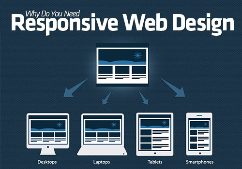
A responsive design or theme can be viewed comfortably on all desktop, laptop, tablet and mobile screens. The site remains intact and its viewport adjusts itself to the new dimensions of the browser.
Why was the need for a responsive design felt?
Until some time ago, different versions of the same website were created to improve the experience of the mobile and tablet users. A user could simply click on a link and switch the site view to the version made for a mobile or for a tablet. This was a very reasonable idea to help the mobile audience initially. While this felt enough earlier, the following increase in the number of web enabled devices made this very challenging. Imagine the number of web enabled devices launched everyday. Understanding, maintaining and customizing a website for each device is not practical.
People expected to experience full-fledged website experiences on their smartphones. The mobile version fell inadequate here. With responsiveness it is possible to extend a complete web experience to the user on their mobile devices.
Screen sizes and resolutions vary greatly these days. Each screen size or resolution can support a web browser with different dimensions.
This was the factor that majorly lead to the incorporation of a more universal responsive design practice on a larger scale. With responsive designing, it becomes possible to add flexibility to the components of the web pages.
Why do you need a responsive website?
There has been a rapid increase in the mobile and tablet traffic in the recent times. Your site too could have a large percentage of mobile and tablet audience. To provide them with a consistent and smooth navigation over your site, it is necessary for you to choose responsive themes and designs.
How is responsiveness achieved?
Essentially responsive technology is based on CSS media queries and fluid grids.
Fluid grids are designed around proportions instead of pixels and percentage. As a result, when the site layout shrinks or expands, the elements on the site re-size in proportion with one another.
With CSS media queries, you can apply CSS rules conditionally based on several parameters like display-orientation, display-density, screen size and others. Media queries allow users to dynamically place elements in the web pages.
How can you test if your site is responsive?
Here you have options to test your site or theme over various resolutions:
I would like to thank you for posting such an useful blog. It seems to be very useful for now and always in the future. The time spend usefully will never go wrong and will unveil new informations undoubtadely. Hence, this would be useful for all when things take us to reach our knowledge to one extent..
We are a bunch of volunteers and opening a brand new scheme in our community.
Your website provided us with valuable info to work on. You have
done a formidable activity and our whole community will be thankful to you.