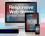
Responsive Web Design is a best way to optimize website viewing in different kind of devices such as desktop, tablet, mobile etc. This kind of website get more traffic compare to other websites. Responsive website dynamically reduce website size and increase website loading speed for various devices.
 Some responsive frameworks give ability to design responsive websites. If you design new responsive theme or change your website theme as responsive, that will definitely increase your website quality and users. Google officially recommended Responsive web design. This tutorial suitable for beginners, intermediate users, professionals in web design.
Difference between ordinary CSS Style sheet and Responsive CSS Style sheet.
In Responsive webdesign, some CSS style sheet element defined in %.
img {
max-width : 100%;
}
In Responsive webdesign, CSS Style sheet contain @media query to change rules and sizes based on various devices.
Example: @media only screen and (max-width: 600px) { .. } [for smart phones]
@media only screen and (min-width: 992px) {..} [for desktops]
How to Create Responsive Web Design Based Website?
Step 1: First create HTML file with CSS Id and Class for your theme.
<html>
<head>
<title> Demo about Responsive Webdesign </title>
</head>
<body>
<header>
<h1>responsive Web Design tutorial</h1>
</header>
<article id="one">
<h2>Responsive Web Design</h2>
<section class="one">
<p>Some Demo Content here...</p>
</section>
</article>
<aside>
<h2>sidebar</h2>
<p>Some Demo Content here...</p>
<p>Some Demo Content here...</P>
</aside>
<footer>
<p>Copy Right information</p>
</footer>
</body>
</html>
Step 2:Add View port Meta tag
First of all you need to trigger browser to render your website page more readable scale. So add following meta viewport tag before </head>. It will say that your website page is properly scaled inside any screen size such as mobile screen.
<meta name=”viewport” content=”width=device-width, initial-scale=1, maximum-scale=1″>
Step 3:Next you need to add style sheet.
you can two ways to add style sheet.
first way : use<style> </style> tag inside </head> tag in your html file.
Add CSS rules inside this <style> </style> tag.
Next way: Create separate style sheet and link this style sheet inside </head> tag in your html file.
Example : <link rel=”stylesheet” type=”text/css” href=”style.css”>
Here change style.css name instead of your css file name.
aside, article, section, header, footer, nav {
display: block;
}
aside, article, section, header, footer, nav, html, body, p, h1, h2, h3, div {
margin: 0;
padding: 0;
}
Add Some background for your theme
html {
background: #EDEDED;
}
body {
margin: 0 auto;
background: #fff;
font: 90%/1.6 georgia,serif;
}
Give some content styles
/*content styling*/
header {
background: #F7A42F;
padding: 50px 25px 10px 0;
color: #fff;
margin-bottom: 2em;
}
h1 {
text-align: right;
font-size: 3em;
font-weight: normal;
font-variant: small-caps;
letter-spacing: .1em;
}
p {
margin-bottom: 1em;
}
article {
text-align: justify;
}
article h2 {
font-size: 2em;
font-weight: normal;
margin-bottom: .2em;
}
article p {
font-size: 1.2em;
margin-bottom: 1em;
}
aside {
font: .9em sans-serif;
}
aside h2 {
font-size: 1.2em;
margin-bottom: 1em;
}
footer {
background: #E08B14;
font: 1.2em sans-serif;
text-transform: uppercase;
letter-spacing: .2em;
text-align: center;
color: #fff;
}
Step 4:open your .css file and add CSS rules
First clear spaces and margin from all elements such as article,header etc.
aside, article, section, header, footer, nav {
display: block;
}
aside, article, section, header, footer, nav, html, body, p, h1, h2, h3, div {
margin: 0;
padding: 0;
}
Add Some background for your theme
html {
background: #EDEDED;
}
body {
margin: 0 auto;
background: #fff;
font: 90%/1.6 georgia,serif;
}
Give some content styles
/*content styling*/
header {
background: #F7A42F;
padding: 50px 25px 10px 0;
color: #fff;
margin-bottom: 2em;
}
h1 {
text-align: right;
font-size: 3em;
font-weight: normal;
font-variant: small-caps;
letter-spacing: .1em;
}
p {
margin-bottom: 1em;
}
article {
text-align: justify;
}
article h2 {
font-size: 2em;
font-weight: normal;
margin-bottom: .2em;
}
article p {
font-size: 1.2em;
margin-bottom: 1em;
}
aside {
font: .9em sans-serif;
}
aside h2 {
font-size: 1.2em;
margin-bottom: 1em;
}
footer {
background: #E08B14;
font: 1.2em sans-serif;
text-transform: uppercase;
letter-spacing: .2em;
text-align: center;
color: #fff;
}
Step 5: Next add some media query inside your CSS
If you want to create responsive design, first you need to assign or edit some media query inside your .CSS style sheet file.
Media queries are used to skip or change CSS rules in minimum or maximum width of devices.
If you want to know various devices displayed pixel density use Wikipedia list.
/*layout styles*/
@media all and (min-width: 780px) {
/*layout*/
body {
width: 85%;
max-width: 1280px;
min-width: 960px;
}
article {
float: left;
width: 64%;
padding-left: 2.5%;
}
aside {
float: right;
width: 26%;
padding: 0 2.5%;
border-left: 1px solid #aaa;
}
section {
-webkit-column-count: 1;
-moz-column-count: 1;
column-count: 1;
-webkit-column-gap: 1em;
-moz-column-gap: 1em;
column-gap: 1em;
padding-bottom: 1em;
margin-bottom: 1em;
border-bottom: 1px solid black;
}
section:last-of-type {
border-bottom: none;
}
footer {
clear: both;
padding: 25px 0 15px;
}
}
@media all and (min-width: 481px) and (max-width: 780px) {
/*layout*/
body {
width: 90%;
max-width: 780px;
min-width: 485px;
font-size: 80%;
}
article {
float: left;
width: 56%;
padding-left: 2.5%;
}
aside {
float: right;
width: 34%;
padding: 0 2.5%;
border-left: 1px solid #aaa;
}
footer {
clear: both;
padding: 25px 0 15px;
}

/*content styles*/
h1 {
font-size: 2.4em;
}
footer {
font-size: 1em;
}
}
@media all and (max-width: 480px) {
/*layout*/
body {
width: 90%;
max-width: 480px;
}
article {
padding: 0 5%;
}
footer {
padding: 25px 0 15px;
}
/*content styles*/
header {
padding: 25px 15px 5px 0;
}
h1 {
text-align: right;
font-size: 2em;
}
article {
text-align: left;
margin-bottom: 1em;
}
aside {
border-top: 1px solid black;
padding: 1em 5% 0;
line-height: 2;
}
footer {
font-size: .7em;
}
}
Now save your file and open this file in your browser. Scale your browser to check its responsive.
Google officially recommended CSS media query for smartphones is:
@media only screen and (max-width: 640px) { … }
Targeted media queries for smartphones (landscape), tablets (portrait), desktops (narrow) is:
@media screen and (min-width: 480px) and (max-width: 800px) {..}
Targeted media queries for smartphones (portrait) is :
@media screen and max-width: 479px){..}
Targeted media queries to adjust flows and looks on various devices is :
Landscape Mode :
@media all and (orientation: landscape) {…}
portrait Mode :
@media all and (orientation: portrait) {..}
How can you test if your site is responsive?
Here you have options to test your site or theme over various resolutions:
This website was… how do I say it? Relevant!!
Finally I’ve found something that helped me. Cheers!
Does your blog have a contact page? I’m having trouble locating it
but, I’d like to send you an email. I’ve got some recommendations for your blog you might be interested in hearing.
Either way, great site and I look forward to seeing
it improve over time.
Contact email: walke.prashant28@gmail.com
Thanks for finally talking about >Create a Responsive Web
Design | Prashant Walke <Loved it!
Hi, the whole thing is going well here and ofcourse every one is sharing facts, that’s in fact
good, keep up writing.
Hello, i read your blog occasionally and i own a
similar one and i was just wondering if you get a lot of spam comments?
If so how do you reduce it, any plugin or anything you can recommend?
I get so much lately it’s driving me insane so any help is very much appreciated.
I love your blog.. very nice colors & theme. Did you
make this website yourself or did you hire someone to do it for you?
Plz reply as I’m looking to design my own blog and would like to
find out where u got this from. thanks a lot
Yes, I have create this blog site using SUITS Theme.
if you need customization or design your own blog then drop mail :walke.prashant28@gmail.com
Hi there just wanted to give you a quick heads up. The words in
your article seem to be running off the screen
in Opera. I’m not sure if this is a format issue or something to do with browser compatibility but I thought I’d post to let you know.
The layout look great though! Hope you get
the problem solved soon. Many thanks
Here is articles that’s not really much a tutorial as it can be a manual to making web
site design that is responsive. ‘s guide
I feel this is one of the such a lot significant info for me.
And i’m happy studying your article. However want
to commentary on few general issues, The web site style is great,
the articles is in point of fact excellent : D.
Just right job, cheers